designing...and more designing...design.
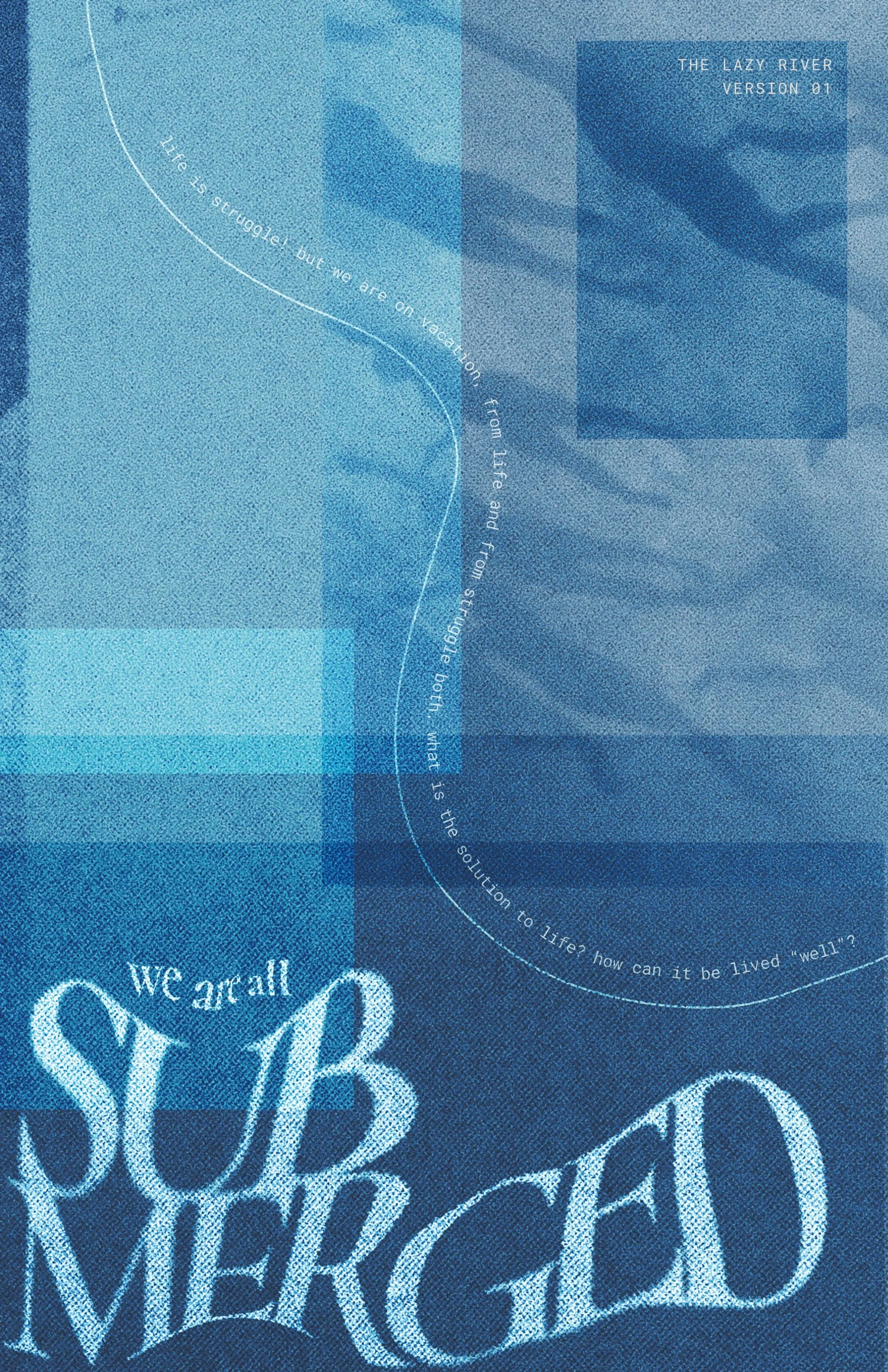
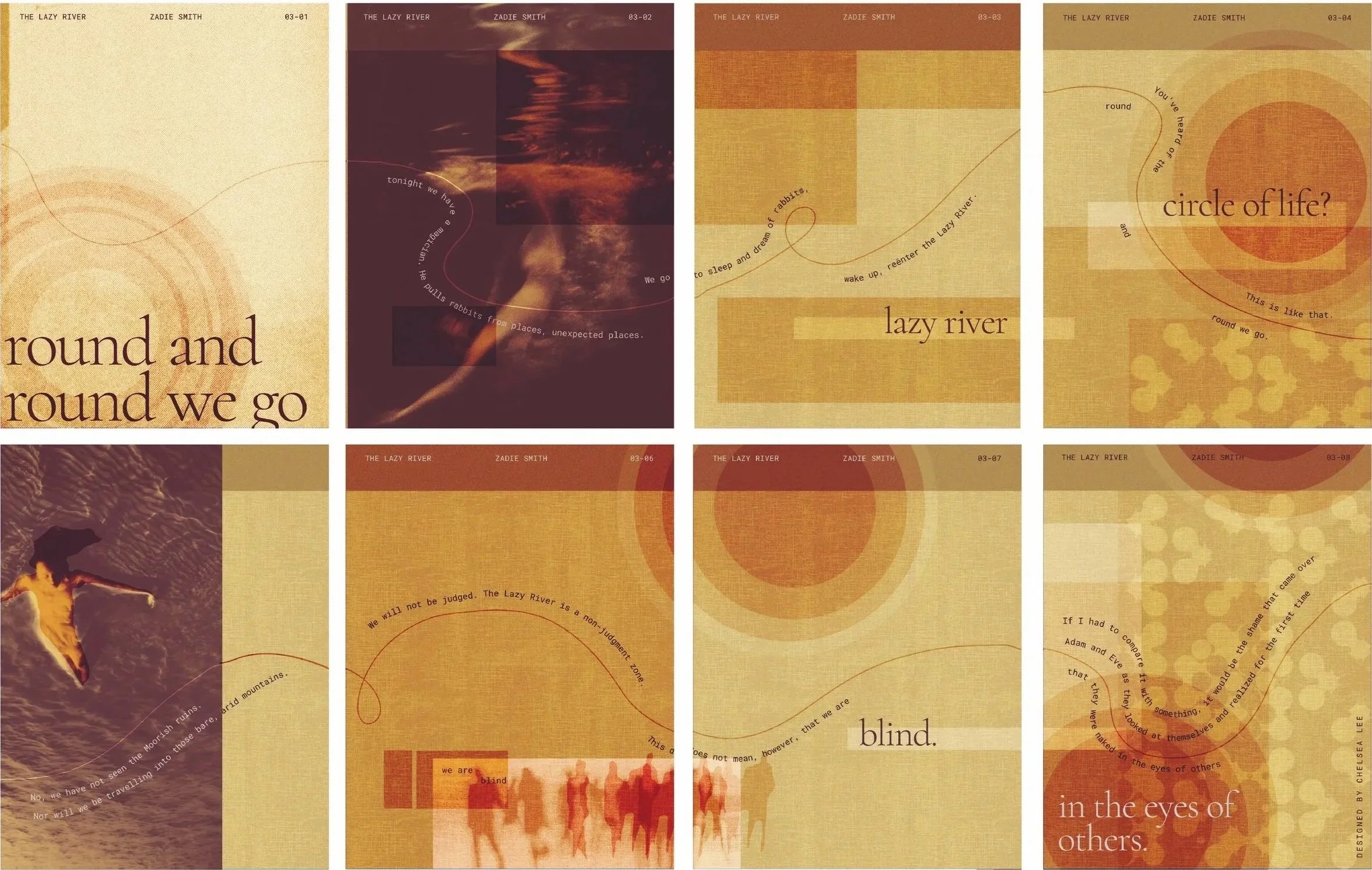
the design of a story: “the lazy river” by zanie smith
ADOBE INDESIGN, ADOBE PHOTOSHOP, PAPER COLLAGE, 2026
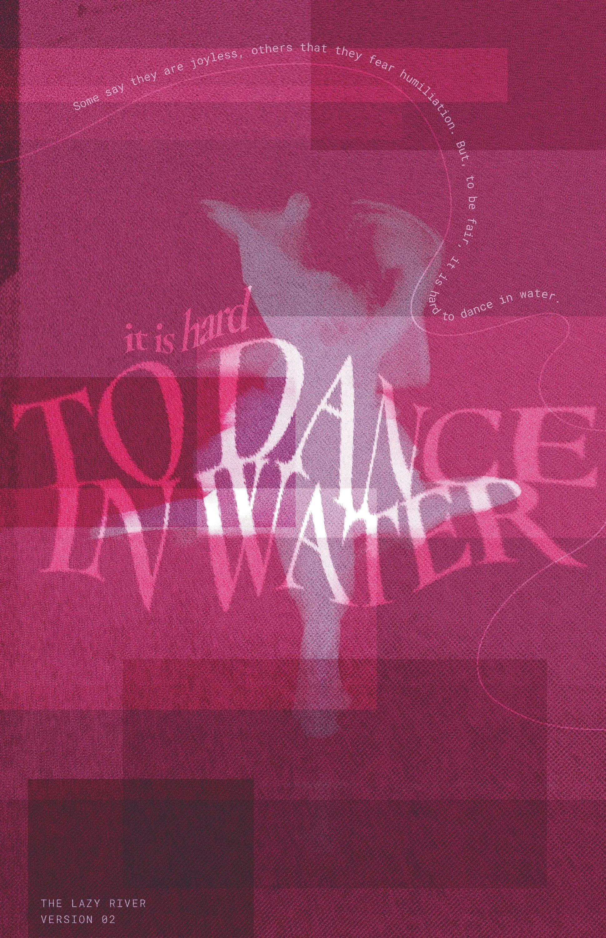
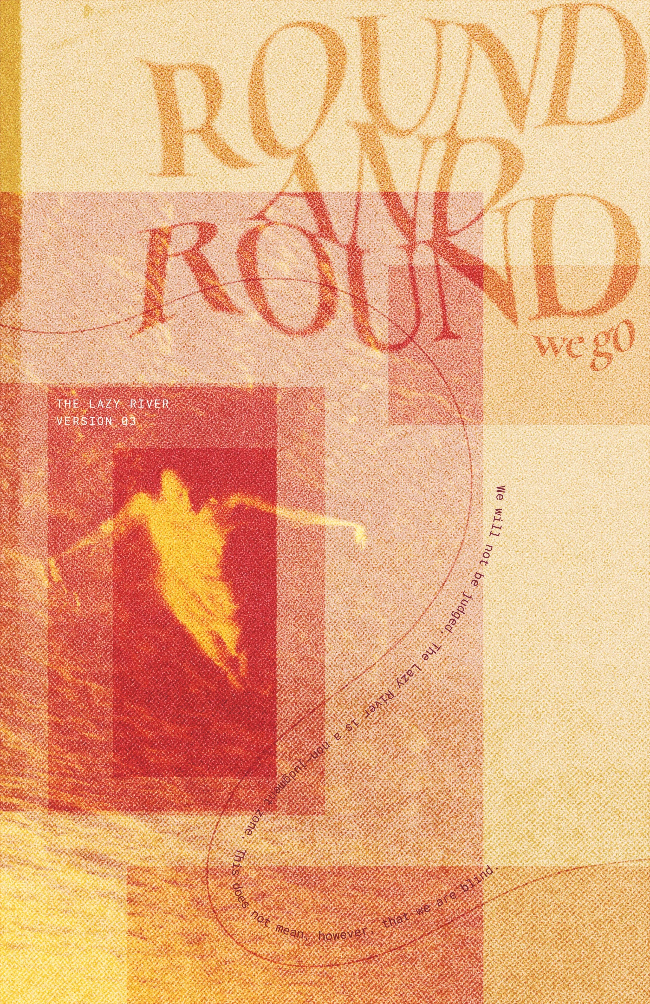
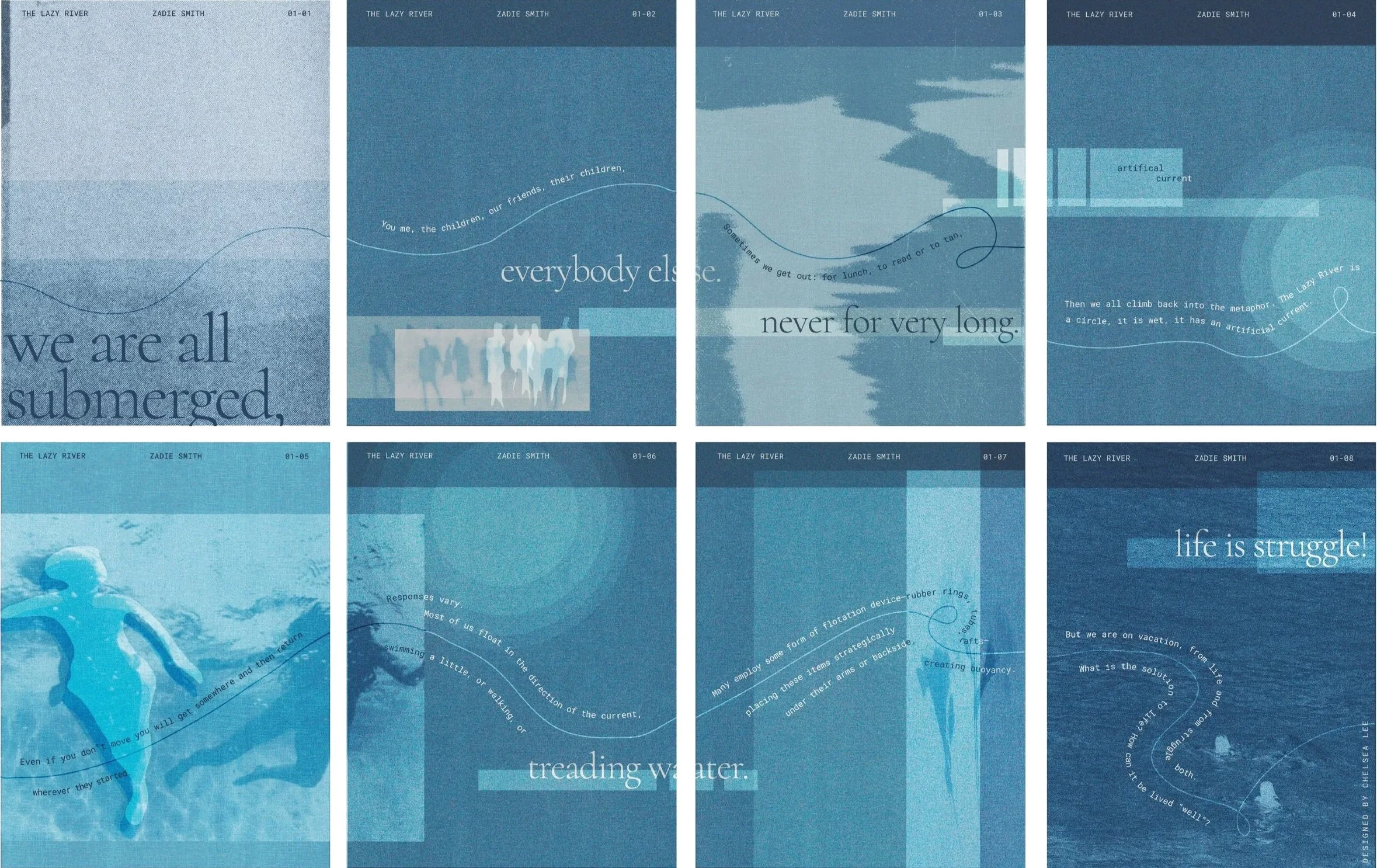
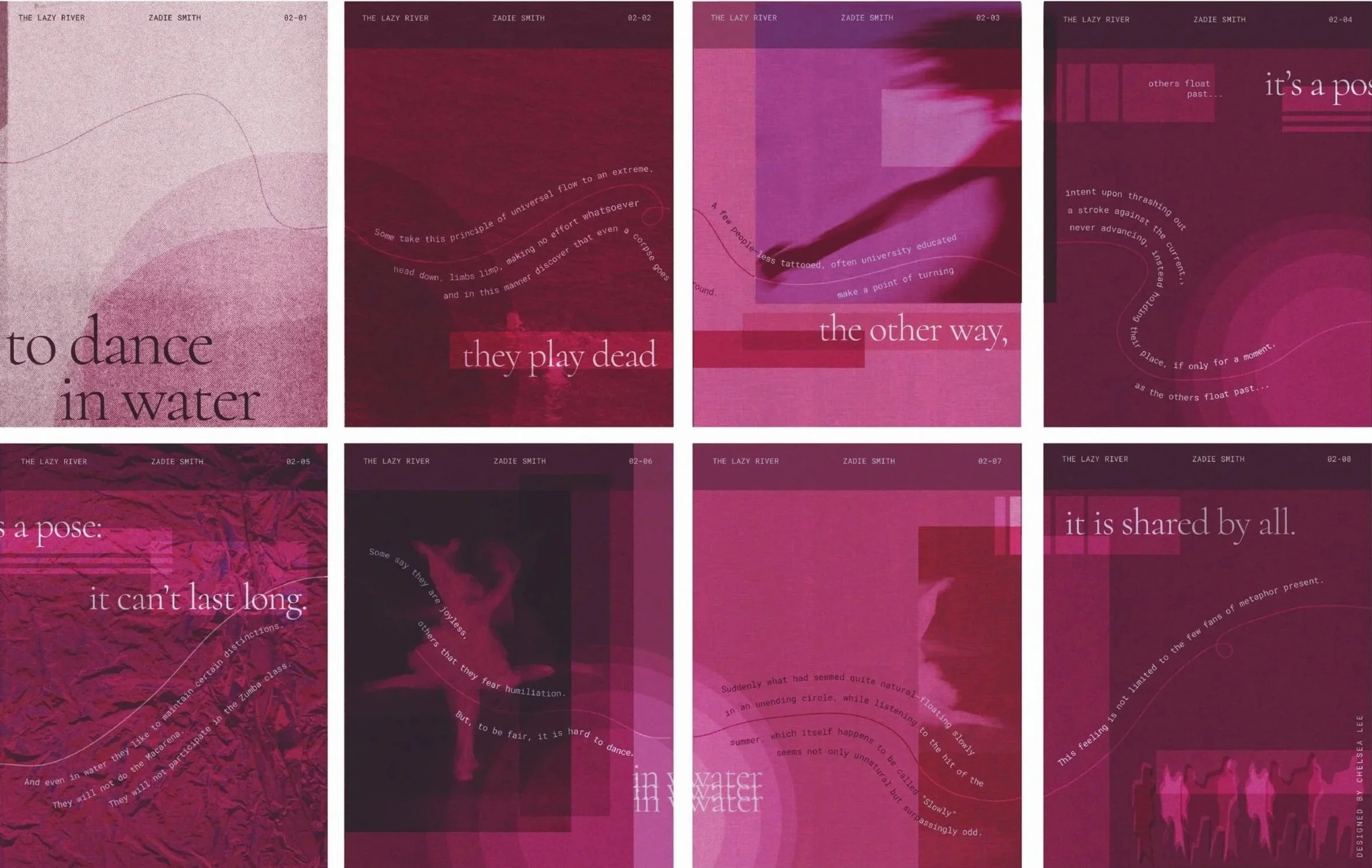
I took pieces of text from Zanie Smith’s “The Lazy River” in order to establish a theme of the harsh fluidity of life and the absence of escapism. Limited to only three colors, I created a set of three posters, where when you fold and reverse them, they transform into a booklet. I mainly focused on flowing design elements and collaging and scanning images to create my final pieces.
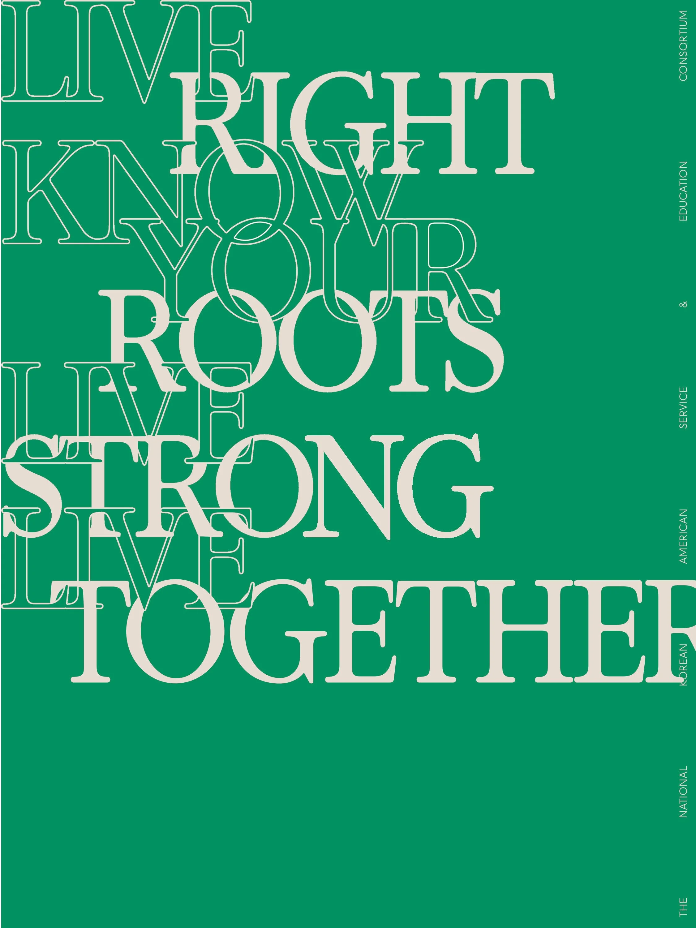
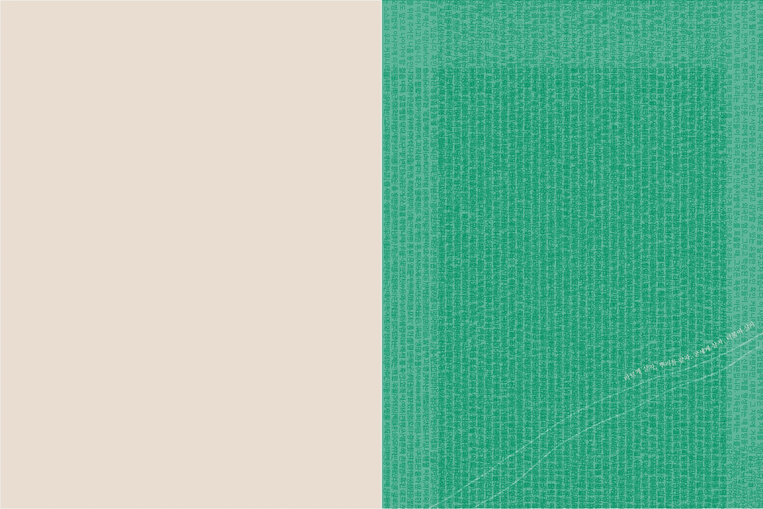
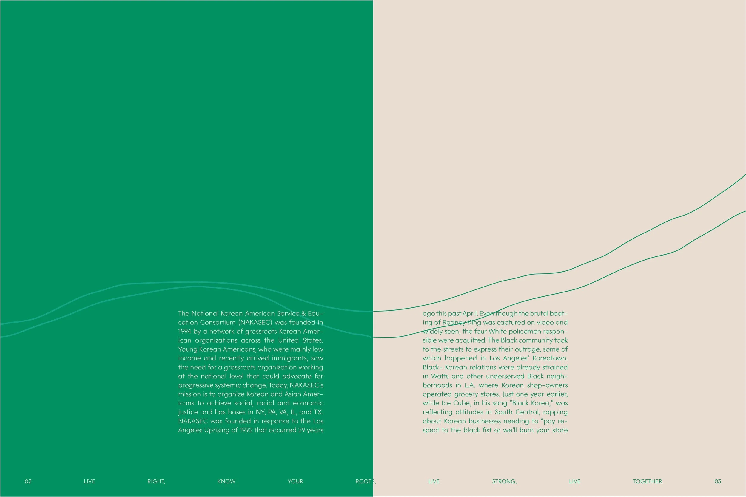
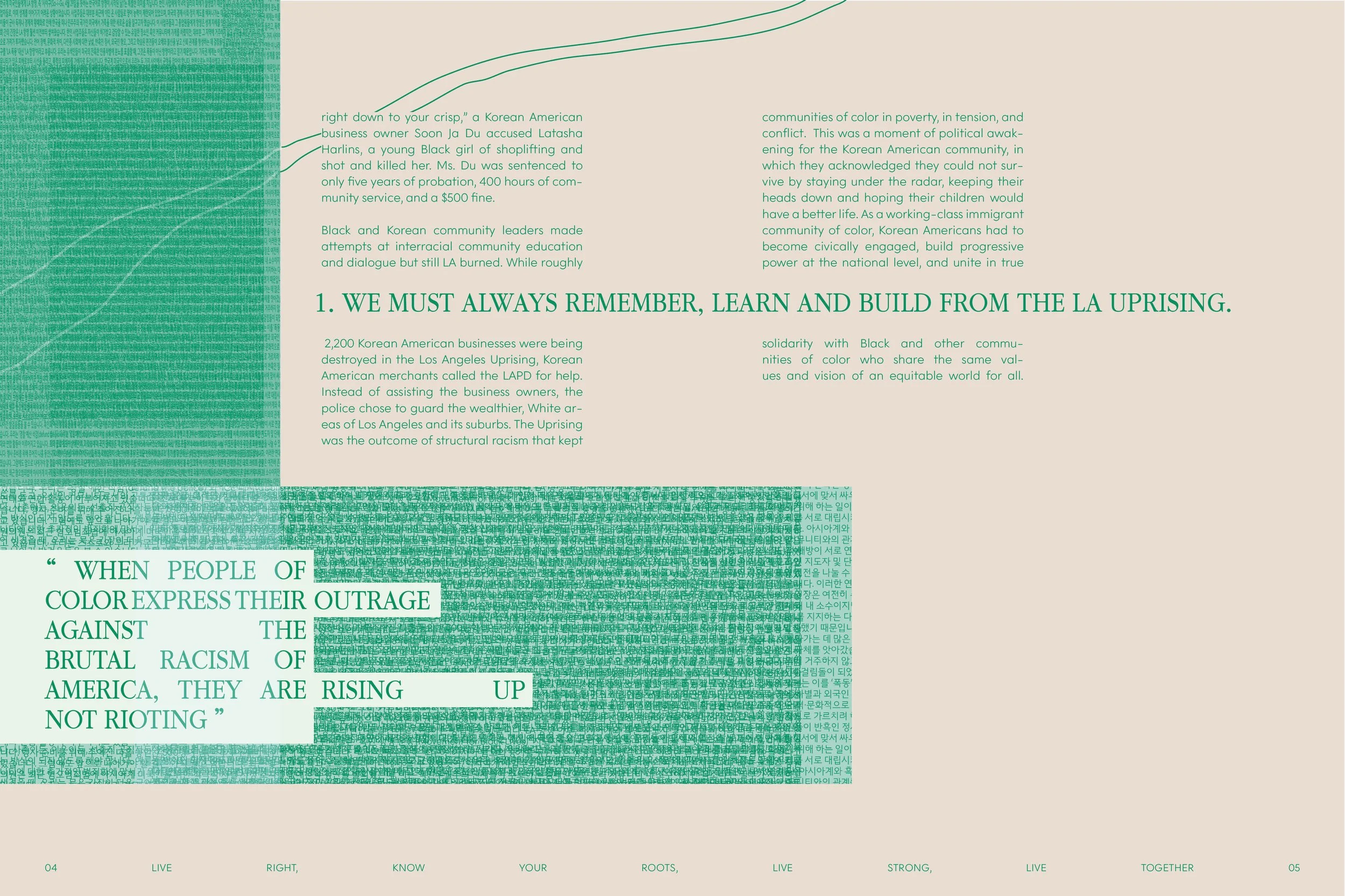
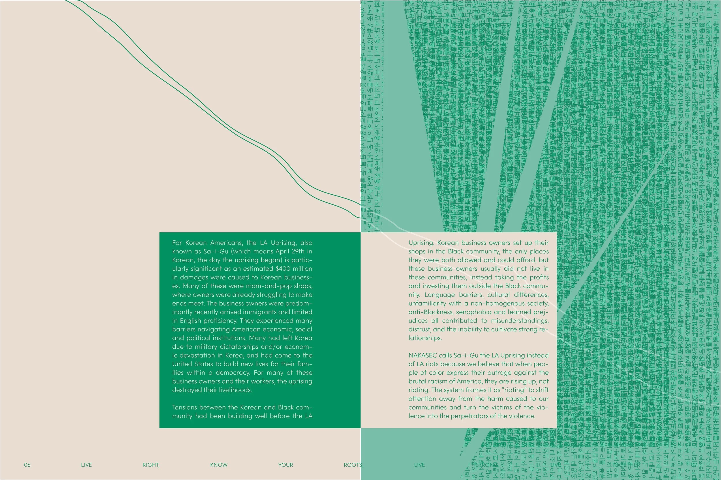
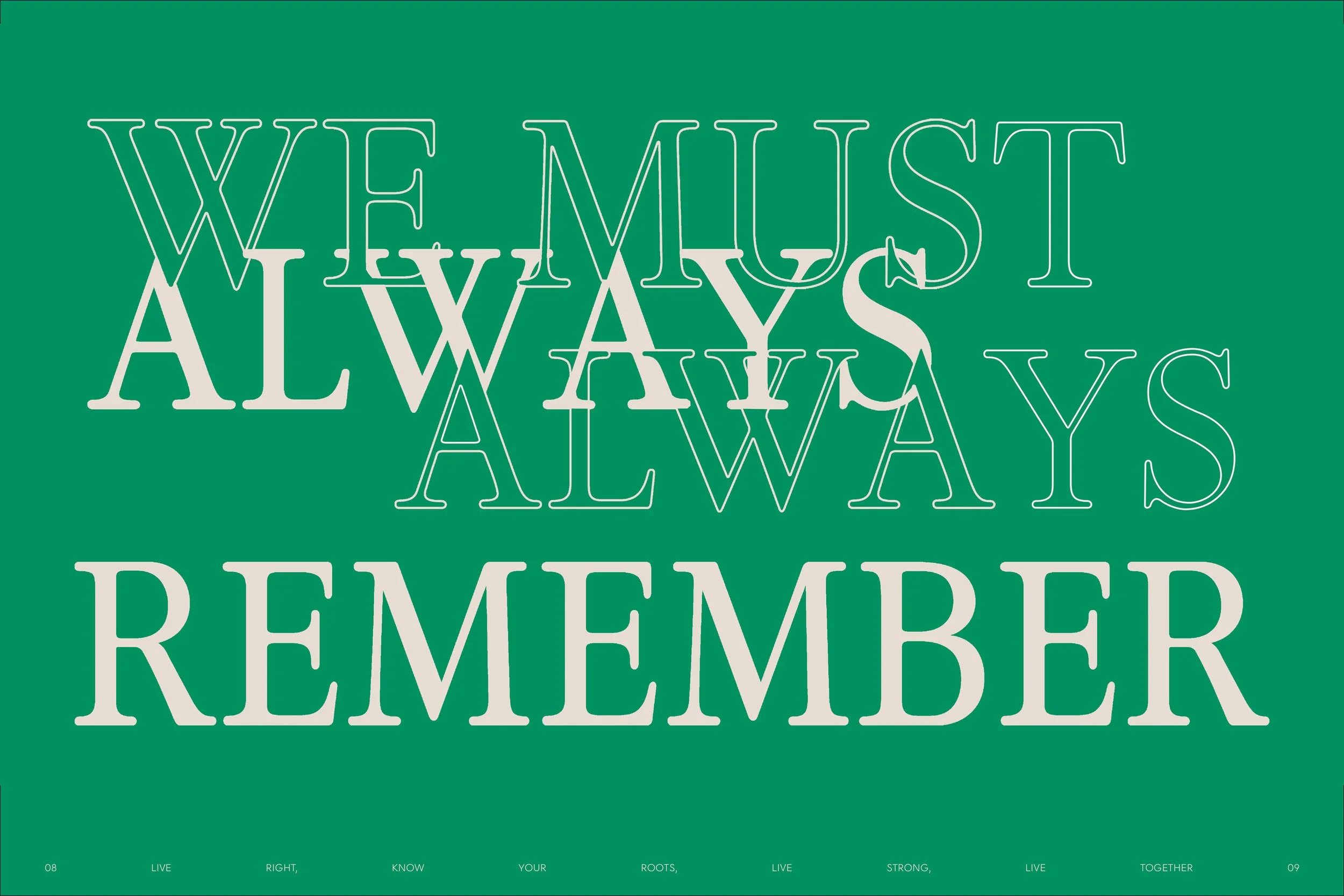
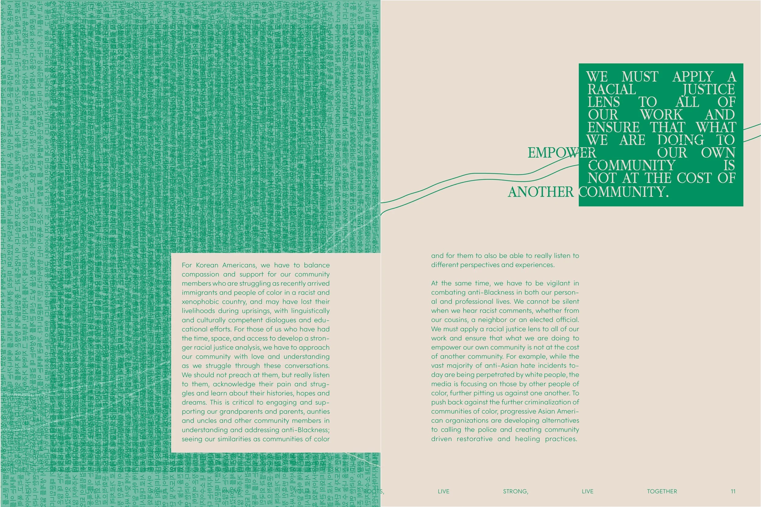
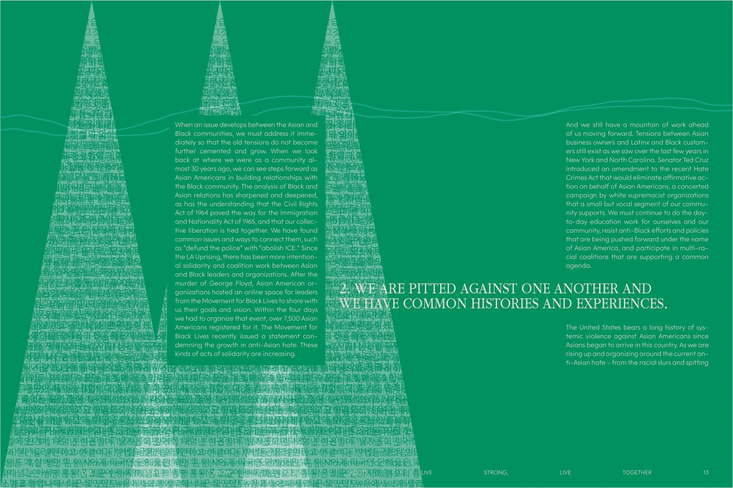
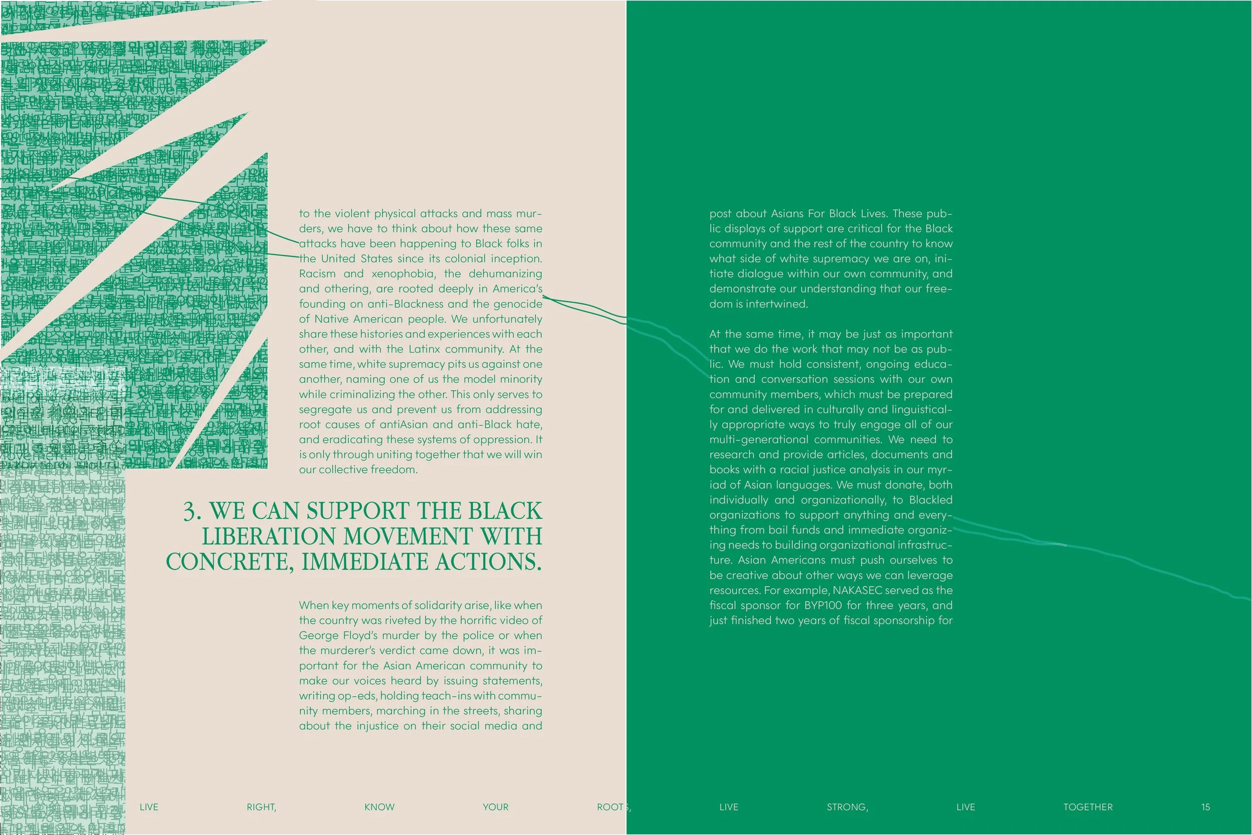
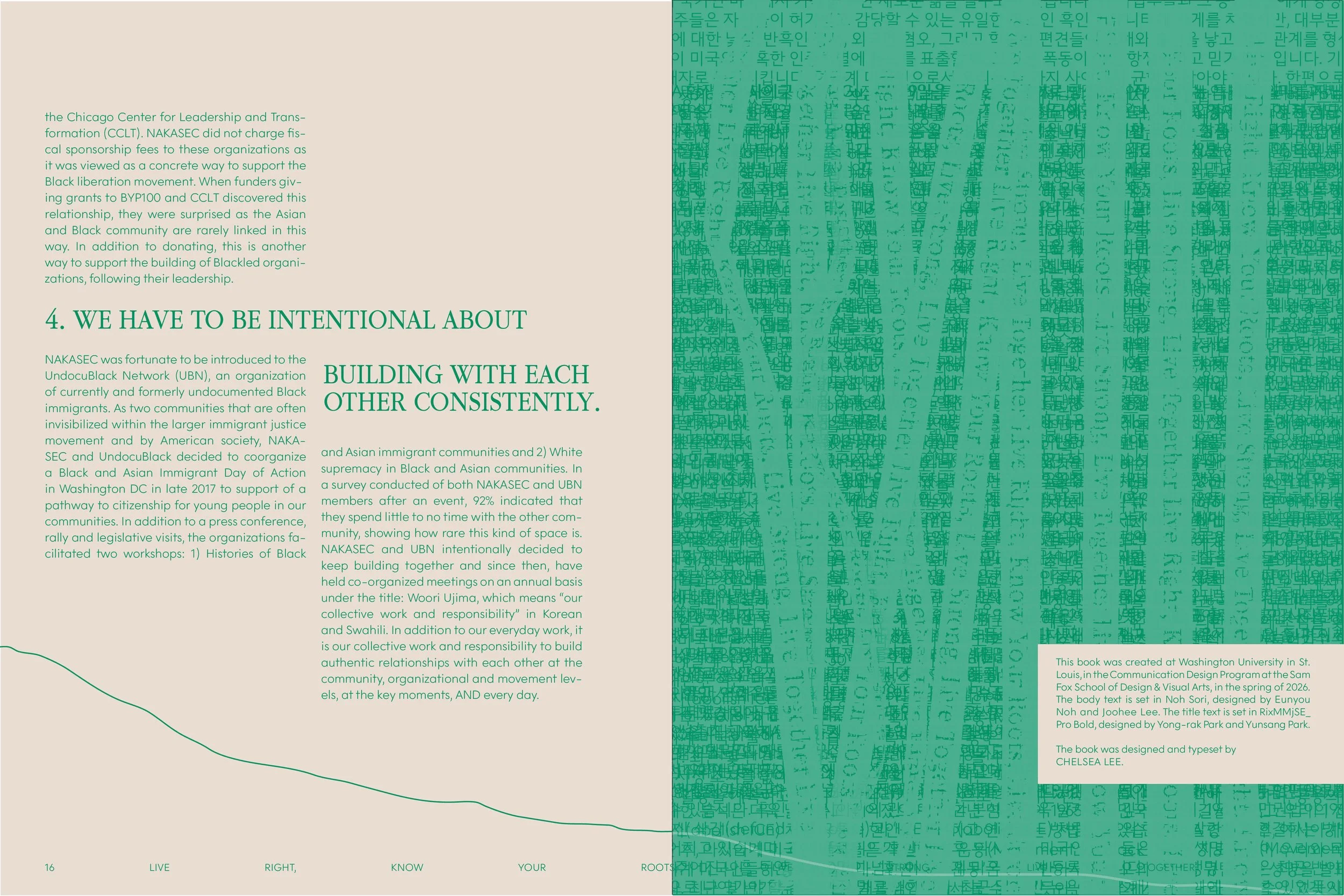
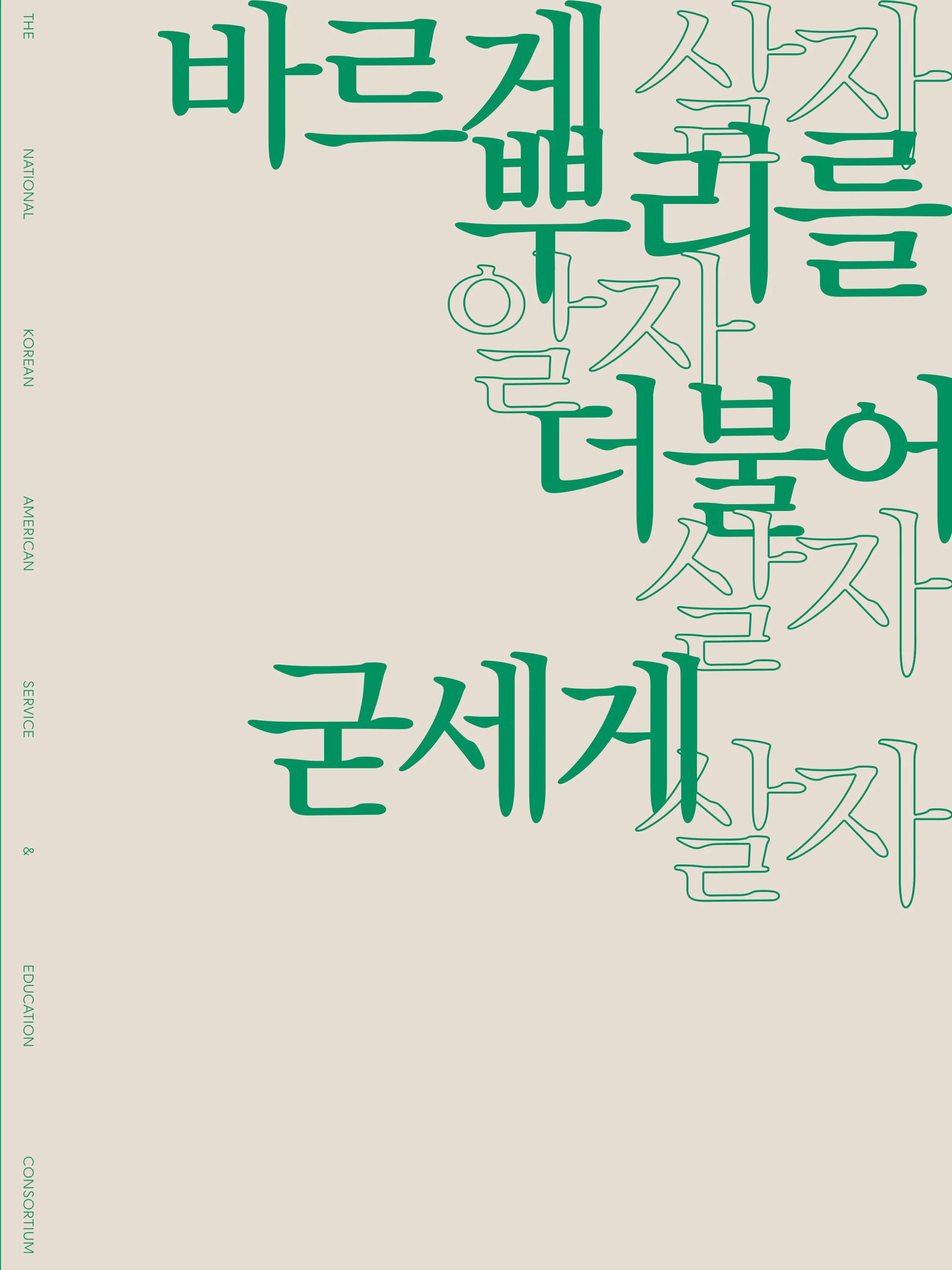
“live right, know your roots, live strong, live together.”
ADOBE INDESIGN, ADOBE PHOTOSHOP, PAPER COLLAGE, 2026
I designed the National Korean American Service & Education Consortium’s “Live Right, Know Your Roots, Live Strong, Live Together” article into a book. The original article is written in Korean, and is an inspiring call to action about the systemic violence against both Korean-Americans and immigrants as well as Black communities. However, the persistent racial segregation between the two groups, towards each other, continues to remain, and in order to diminish exterior aggression, internal unity must occur. Therefore, my design builds off of an overarching theme of both disorder and togetherness, with the lines representing the two groups, in which they slowly become one.
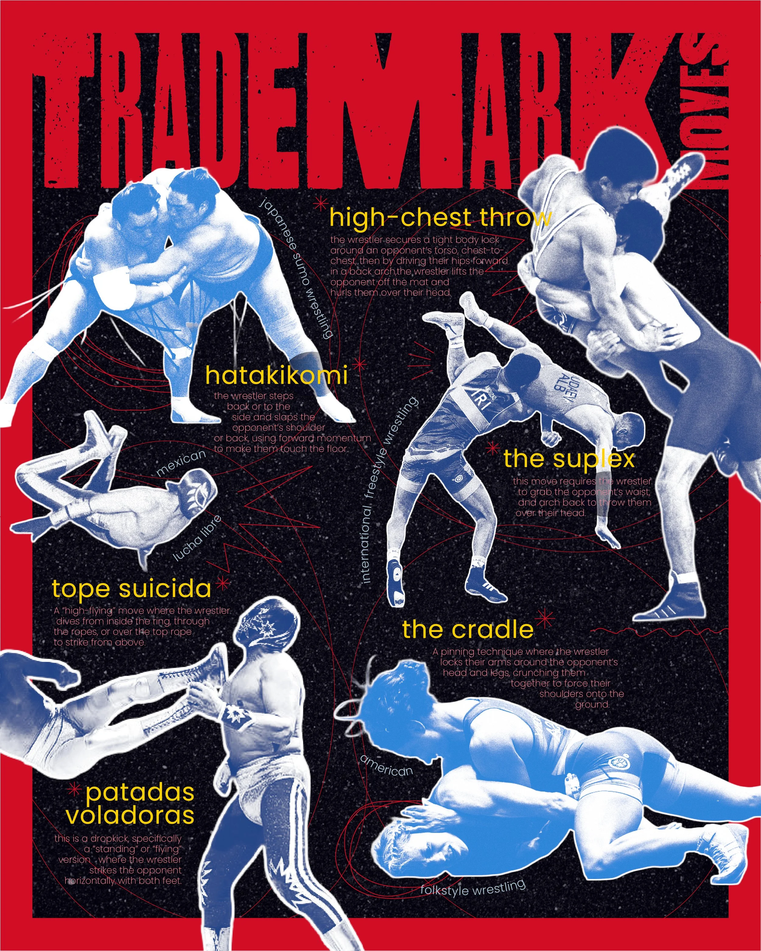
trademark: wrestling around the world
ADOBE INDESIGN, ADOBE PHOTOSHOP, 2026
I focused on a specific theme within the more general category of wrestling, which are the trademark moves within various wrestling cultures. I pushed the limits of scale hierarchy and played with more graphic elements, a style I usually do not lean towards. Subtle wrestling elements are sprinkled throughout the design, such as the figures coming off of the “ring”, or border of the poster, as well as the the lines dividing the different groupings.
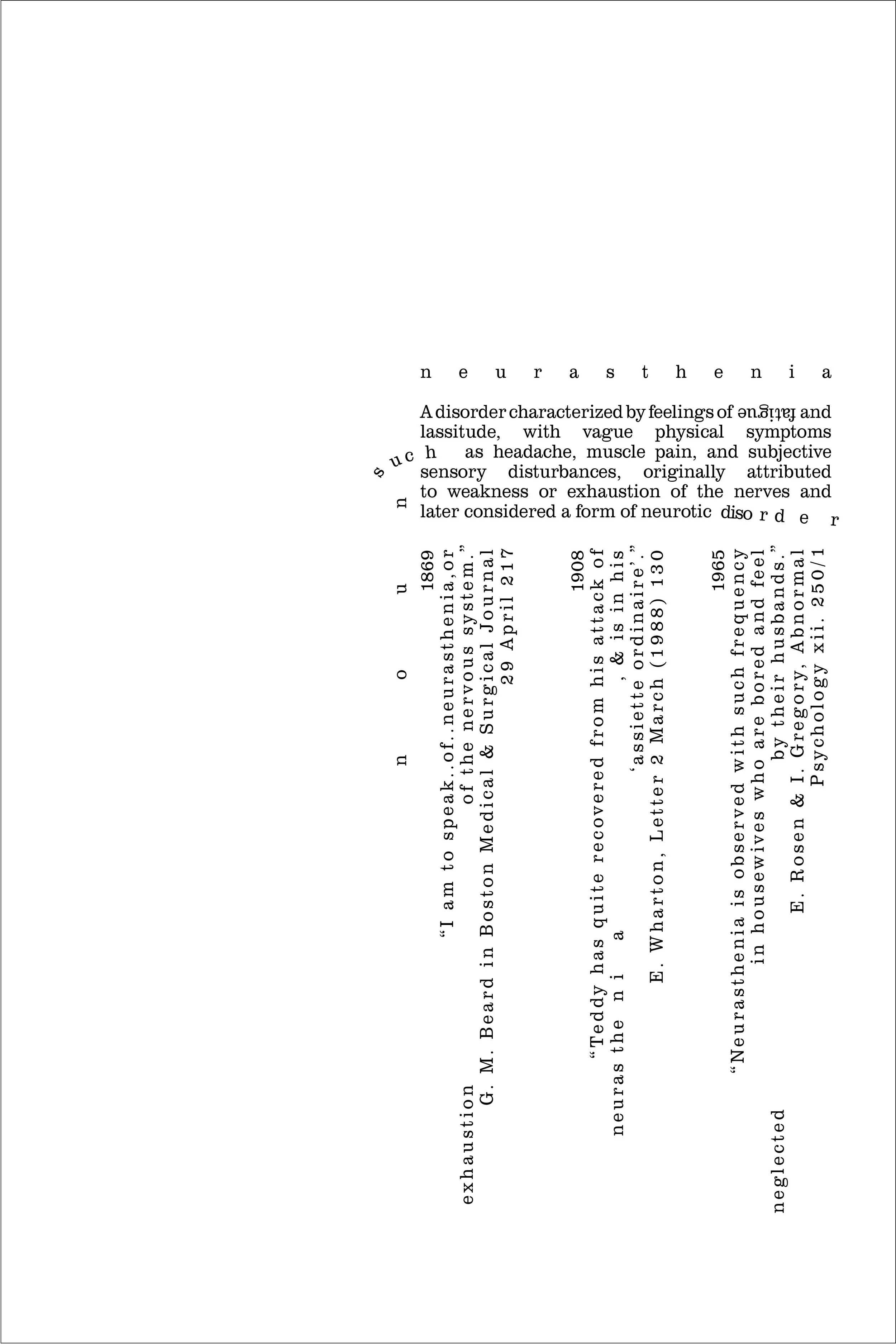
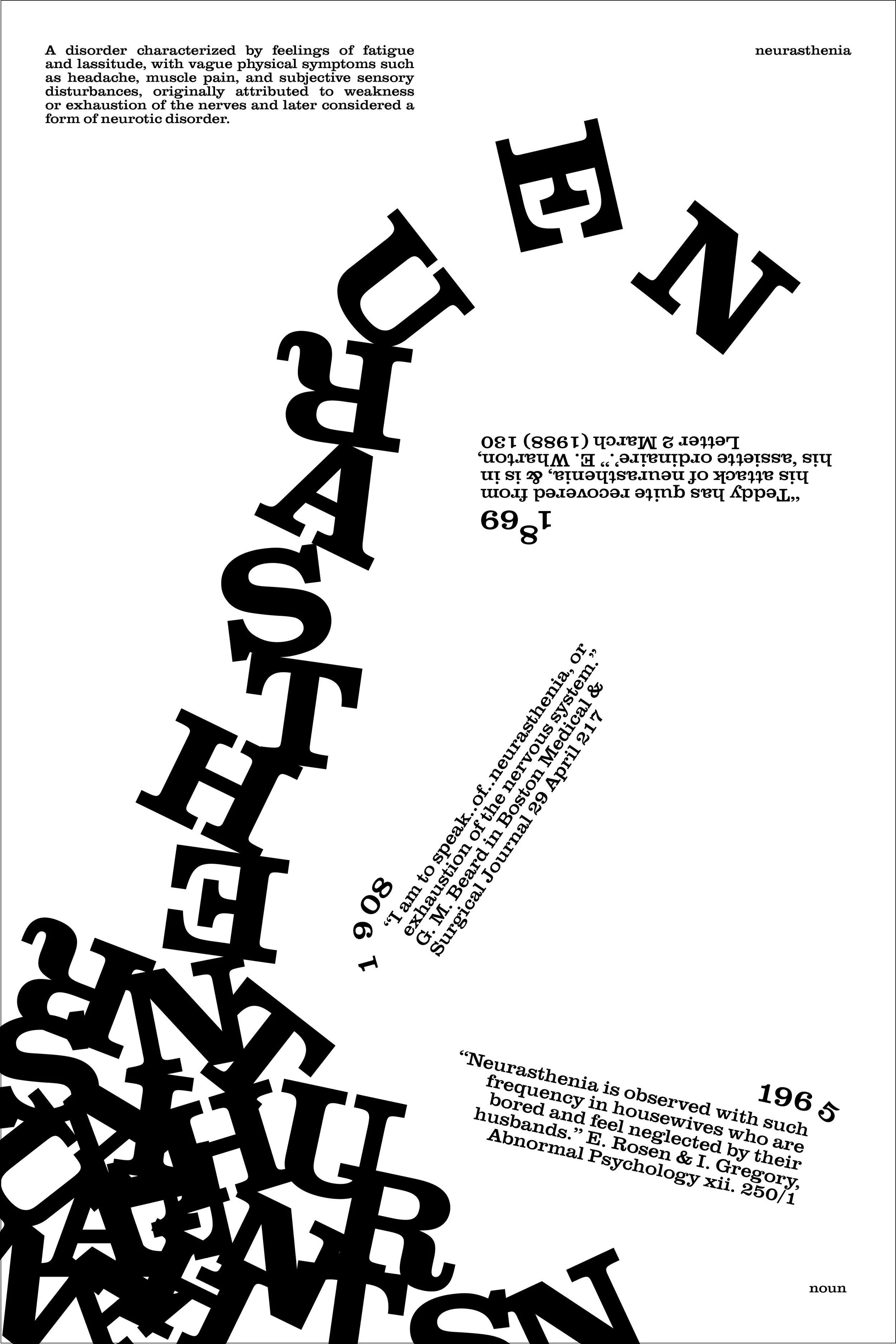
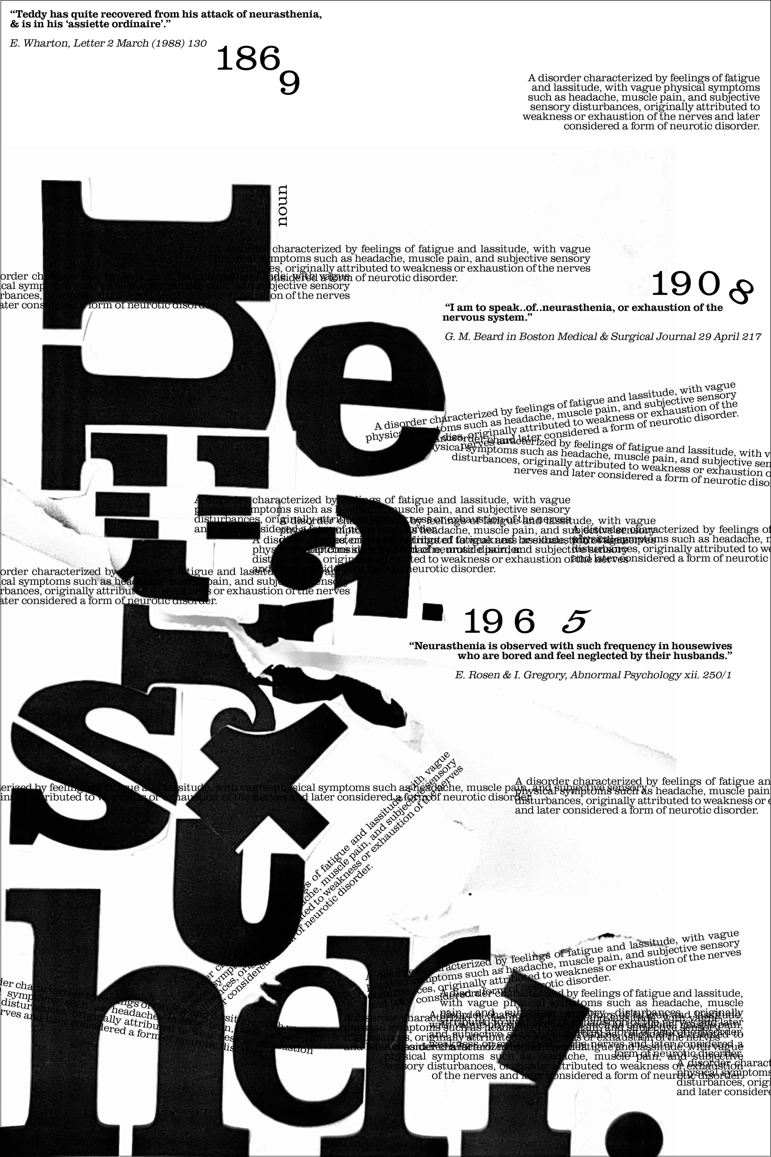
the semantics of space
ADOBE INDESIGN, PAPER COLLAGE, 2026
This set of three posters depicts the word “neurasthenia” in three different renditions. The first poster is limited to one typeface, one point size, and one text style, which pushed me to really immerse myself in how I could visually interpret the meaning of the word through composition and spacing. The second poster opens up the constraints a bit further, with the addition of text styles as well four different point sizes. The third poster includes an analog collage of the word, as well as four different point sizes, and unlimited text styles. Beyond testing myself with these constraints, the word I chose for myself forced me to become comfortable with disarray and illegibility.